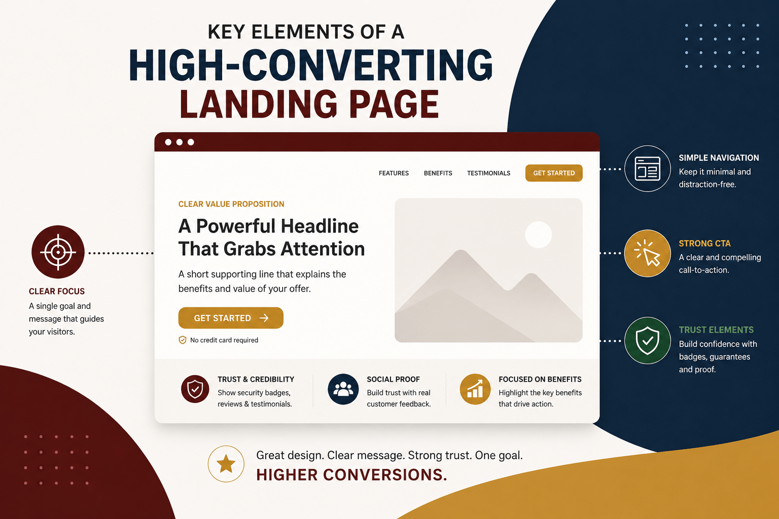
A landing page has one job: convert visitors into customers or leads. Whether your goal is generating enquiries, collecting email subscribers, or driving sales, every element on the page should guide visitors toward a single, clear action.
Unlike a homepage, which serves multiple purposes, a landing page eliminates distractions and focuses on delivering the right message to the right audience. By optimizing a few key elements, you can significantly improve conversion rates and maximize the return on your marketing efforts.
The foundation of a successful landing page lies in these key elements that encourage action and boost conversions.
1. Write a Compelling Headline
Your headline is the first thing visitors notice, and it often determines whether they’ll stay or leave. An effective headline immediately communicates the value of your offer and explains why it’s worth their attention.
Instead of a generic headline like:
“Our Product”
Use something more specific and benefit-driven, such as:
“Reduce Delivery Times by 50% with Smarter Logistics”
A strong headline should be:
- Clear and easy to understand
- Focused on customer benefits
- Specific rather than vague
- Supported by a short subheading that provides additional context
Best Practice: Keep your headline above the fold so visitors can see it without scrolling, and regularly A/B test different versions to improve performance.
2. Build Trust with Social Proof
People are more likely to trust your business when they see that others have had positive experiences. Social proof reassures potential customers that your product or service delivers real results
Effective social proof includes:
- Customer testimonials
- Online reviews
- Case studies
- Success metrics
- Client logos
- Industry awards
Testimonials become even more persuasive when they include a customer’s name, photo, company, or job title.
Best Practice: Position testimonials and trust-building content close to your call-to-action (CTA) to reinforce confidence right before visitors make a decision.
3. Use Clear and Strategic Calls-to-Action (CTAs)
A landing page should make it obvious what visitors should do next. Your call-to-action should stand out visually and use action-oriented language that encourages immediate engagement.
Instead of a button that simply says:
“Submit”
Try more compelling alternatives like:
- Get Started Today
- Book Your Free Consultation
- Download the Free Guide
- Start Your Free Trial
To keep users engaged throughout the page, place CTAs strategically:
- Near the top of the page
- After explaining key benefits
- At the end of the page
Best Practice: Use contrasting button colors and concise action words that create a sense of momentum.
4. Optimize for Speed
Even the most beautifully designed landing page won’t convert if it loads slowly. Visitors expect fast experiences, and every additional second of loading time increases the likelihood that they’ll leave before taking action.
A fast-loading page also improves:
- User experience
- Search engine rankings
- Paid advertising performance
- Overall conversion rates
Best Practice:
- Compress and optimize images.
- Minify CSS and JavaScript files.
- Enable browser caching.
- Use a reliable hosting provider or Content Delivery Network (CDN).
Aim for a page load time of under three seconds to keep visitors engaged.
5. Include Trust Signals
When visitors are considering sharing personal information or making a purchase, trust becomes essential. Small credibility indicators can make a significant difference in reducing hesitation.
Examples of trust signals include:
- SSL security badges
- Secure payment icons
- Money-back guarantees
- Industry certifications
- Privacy statements
- Clear contact information
These elements reassure visitors that your business is legitimate and that their information is safe.
Best Practice: Place trust signals near forms, pricing sections, or checkout buttons where users are most likely to have concerns.
6. Mobile Optimization
With more than half of all web traffic coming from mobile devices, a landing page must perform just as well on a smartphone as it does on a desktop.
A mobile-friendly landing page should feature:
- Responsive layouts
- Large, easy-to-tap buttons
- Readable fonts
- Short, simple forms
- Fast loading speeds
The easier it is for mobile users to complete your desired action, the higher your conversion rate will be.
Best Practice: Test your landing page on multiple screen sizes and devices to ensure a smooth user experience.
Quick Comparison Table
| Element | Goal | Quick Win |
|---|---|---|
| Compelling Headline | Captures attention and communicates value | Use clear, benefit-driven messaging above the fold |
| Social Proof | Builds credibility and reduces uncertainty | Include testimonials, reviews, client logos, and case studies |
| Strategic CTAs | Encourages visitors to take action | Place clear CTAs throughout the page using action-focused language |
| Fast Page Speed | Keeps visitors engaged and improves conversions | Optimize assets and aim for load times under three seconds |
| Trust Signals | Increases confidence and reduces hesitation | Display security badges, guarantees, and contact details |
| Mobile Optimization | Ensures a seamless experience across devices | Use responsive design with mobile-friendly navigation and forms |
Final Thoughts
A high-converting landing page isn’t about flashy design or adding more content; it’s about creating a focused experience that helps visitors make a decision with confidence. Every element should support a single goal, from the headline that captures attention to the call-to-action that encourages users to take the next step..
Start by optimizing the fundamentals: a compelling headline, strong CTA, fast loading speed, and trust-building elements. Once those are in place, continue testing and refining your page based on user behavior and conversion data.
Remember, even small improvements can have a significant impact. A clearer headline, a more persuasive testimonial, or a faster loading page could be the difference between a visitor leaving your site and becoming your next customer.